
THE CHANGING HUES | OF MODERN DESIGN
THE CHANGING HUES | OF MODERN DESIGN
For our fifth post in The Impact of Color Series, we’re going to talk about how color is used in modern design. Keep reading to explore color use over the history of Modernism.
HISTORY OF COLOR IN MODERN DESIGN
Modern design is mostly associated with white and black, but it is no stranger to color either. Following the Art Deco period, modern design represented a break with traditional and exotic colors (like purple, jade, orange, black and gold) to embrace saturated primary colors. But the evolution of color didn’t stop there.

DE STIJL MOVEMENT
The De Stijl movement started in the Netherlands around 1917. Likely a reaction to the excess associated with the Art Deco period and the horrors of World War I, this school of thought was founded in utopian ideals and concepts of harmony, such as the harmony between form and function.
Aesthetically, artists favored geometric forms and primary colors. Dutch architect Gerrit Rietveld, one of De Stijl’s pioneers, used primary colors and abstract forms to create his famous “Red and Blue Chair” in 1918.

Rietveld’s “Red and Blue Chair” considered one of the first to usher in Modernist design, 1918 (source)
BAUHAUS SCHOOL
Thriving almost in parallel to the De Stijl movement was the Bauhaus, a German school of arts that emerged in 1919 and is also largely credited with inspiring the Modernist movement. They focused on bringing craft and art together, creating replicable forms, and prioritizing function.
As for their color theory, one of the school’s teachers, Johannes Itten, named seven fundamental categories of contrast: hue, light vs. dark, cold vs. warm, complementary colors (opposites on the color wheel), analogous colors (three side-by-side colors on the color wheel), saturation, and extension (quantity).
Itten also observed the way each Bauhaus student was attracted to a particular category of contrast. He believed that this attraction revealed inherent, deep-seated connections between personality type and aesthetic choices.

Wassily Chair by Marcel Breuer, Bauhaus Instructor, 1925 (source)
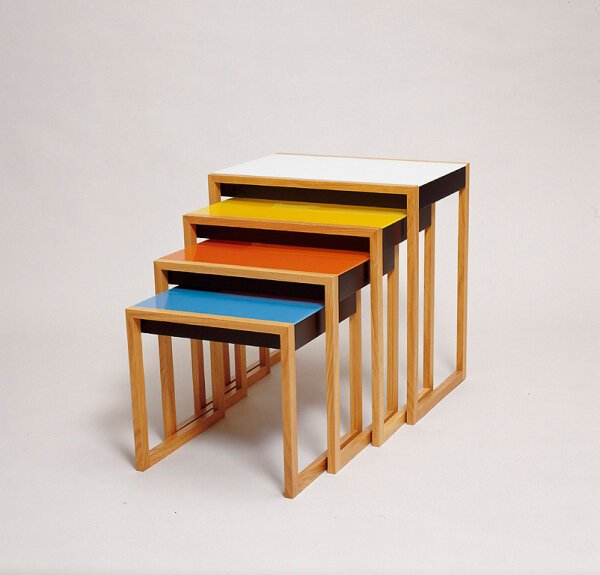
Nesting Tables by Josef Albers, Bauhaus Artistic Director, 1926 (source)
MID-CENTURY
As we shared in our Modernist Designers Series, the decades to follow included design giants like Le Corbusier, Jacques Adnet, Jean Royère, Gio Ponti, and Frank Lloyd Wright. Saturated primary colors may define the early stages of the movement, but many of the designers in those years also used muted colors, natural browns, and neutrals.

Jean Royère’s Elephant armchair, 1955 (source)

Giuseppe Scapinelli’s High Back Chair in Caviuna, 1950s (source)
In the 1950s and following World War II, even more unusual and bold color combinations began to emerge in interior design.
Florence Knoll, an American Modernist designer and founder of Knoll furniture, was especially known for her openness to color. She designed her own lines of modern furniture and gave other Knoll designers creative freedom.
Under Knoll, Eszter Harastzy, director of the textile division and renowned colorist, is credited as the first to pair orange and pink. Pink soon became widespread in fabrics, fashion and cosmetics.
Other adventurous color combinations in this decade included turquoise and lime green, coral and lime green, pink with charcoal, and black accents. These were also the years when color exploded in the kitchen (thanks to innovations in color technology), as appliances and kitchenware.
This purple end table inspires interest and a tone of luxury in our client’s Mission Bay Penthouse.

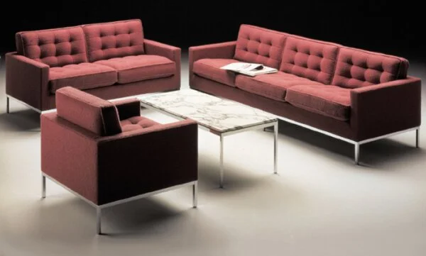
Florence Knoll Lounge Collection, 1954 (source)
THE 1960S AND 1970S
In the 1960s, new dye technology brought color to a level of vibrancy the world hadn’t seen before. Colors were paired to create impact, metals like chrome created flash, and it was considered a decade of color experimentation.
This concept continued into the 1970s, where it encountered innovations in technology toward the end of the decade. The rise of technology’s popularity and the ability of mass-production to meet demand ushered in the rise of industrial metals and synthetic materials in interior design.
Metals were often left exposed, and the design era favored minimalism, such as chrome and polished steel juxtaposed with dull grays and browns of industrial carpeting. Color was sometimes applied to exposed steel framing, but when used, the colors leaned toward saturated and primary.

The famous Pavillon Le Corbusier designed in 1967 in Zurich, Switzerland (source)
THE 1980S AND 1990S
Memphis design was a movement that started in 1981 in Milan, Italy. In retaliation against the minimalism of the 70s, Memphis design embraced bright and radical color, abstract shapes, richly-filled spaces, materials like terrazzo and laminate, and new prints like Ettore Sottass’s Bacterio.

Ettore Sottass, 2004, Bacterio chair print designed in 1974 (source)
The U.S. in the mid-80s also saw a return to opulence (elaborate fabrics, tasseled furniture and window treatments). Color was used sparingly or in softer shades, but the boom in extravagance was short-lived.
As the economy tightened in the 1990s and opposition formed to the color and decor of the 80s, interiors turned to minimalism and experimentation. Some designs were stripped to their simplest forms but retained a sculptural quality.. The general feeling adopted in interiors was a sense of airy lightness in a space.
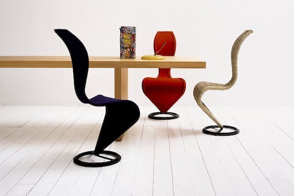
Tom Dixon, S Chair, 1991 (source)
In the final post of our Impact of Color Series, we’ll be sharing Form + Field’s approach to selecting the best colors for interiors.
Until then, what decade inspires you most?
References:
Color: The Secret Influence by Cherie Fehrman and Kenneth Fehrman
https://www.getty.edu/research/exhibitions_events/exhibitions/bauhaus/new_artist/form_color/color/
https://www.theartstory.org/movement/de-stijl/history-and-concepts/